OpenCelliD is the world's largest open database of cell towers with a license CC BY-SA 4.0
Data has full world coverage and freely available for download.
This tabular data[1] has ~40 million rows and 6 columns in it but only 3 columns (latitude, longitude, and type) are used in this visualization.
 [1] Structure of input data.
Above table data is read line by line and grouped by their location info. Grouping is done as if they were XYZ Tiles.
First, empty 2d integer arrays for each tile are created and its elements are initialized with value = 0. Those values hold a counter that shows the number of rows that geographically contained in that pixel. Every row increases the relevant counter by one[2]. After iterating all rows with this method, we end up with a bunch of integer values (in different 2d arrays) that represent row counts per region.
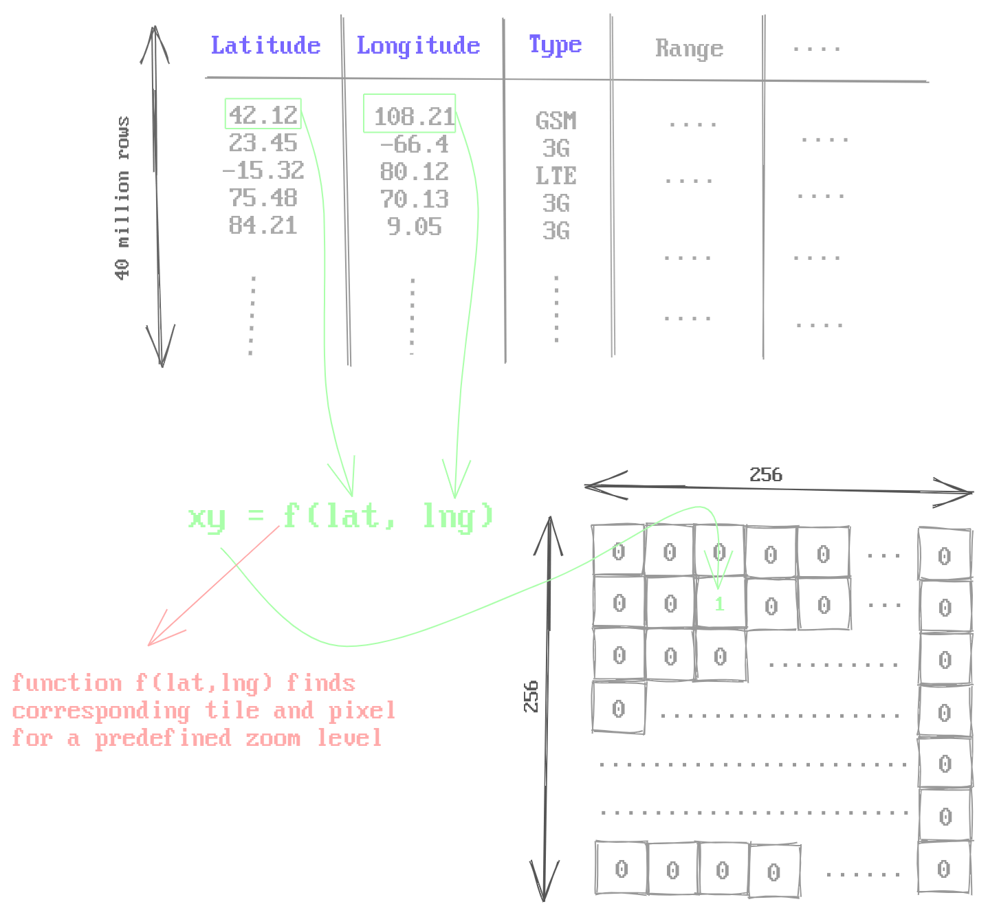 [2] Each row increases relevant counter.
In order to achieve city-level resolution for visualization, tiles up to zoom level 9 should be generated. For XYZ tiles, the number of tiles per zoom level is 4^zoom. Therefore, for zoom levels between 0 to 9, the number of tiles that should be generated becomes 4^0 + 4^1 + 4^2 + .. + 4^9 which equals to 349525. Every tile has 256x256 integer values. Even with using 32 bit-sized integer values, one tile occupies 256 * 256 * 32 bit = 256 kilobytes of storage, and 349525 tiles occupies 87 gigabytes of storage which is definitely not acceptable.
To solve this size problem every tile blob is compressed independently with a modern compression algorithm brotli. Despite being slow to encode, brotli has a fast decoding speed and high compression ratio compared to older compression methods like gzip. Additionally, brotli-compressed-data is natively decodable with all modern browsers. Since there are no cell towers in oceans or uninhabitable areas, tiles for those regions are full of zero values or very sparse. Due to this high redundancy, compression performed extremely well for those regions (256kb compressed to 20~100bytes).
In order to simplify the algorithm, it is described as if there was only one counter value in each pixel, but there are 4 counter values per pixel each holding number of row counts for different cell tower types[3]
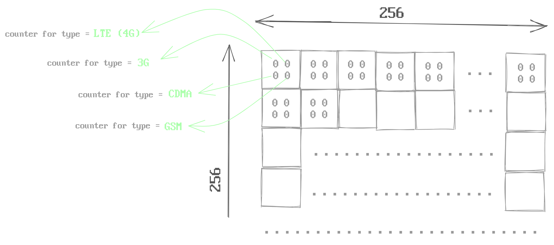 [3] Every pixel stores more than one channels (counter)
Even though these tiles are stored like XYZ tiles, they are not valid XYZ tiles.Since these blobs are just brotli-compressed-integer-arrays. Visualization requires a blob to image conversion. This conversion is done by client side javascript and HTML5 Canvas API.
Underlying map displaying library in this visualization is leaflet. Kudos to leaflet author(s) for writing such a well documented and extendable map library, I was able to write a custom tile layer for leaflet that intercepts the image tile requests made by leaflet and redirects those image tile requests to an image generating (client-side) web worker that works like a tile server. Web worker follows a simple algorithm for image generation. It reads the row count values pixel by pixel and generates a color for that pixel (higher the row count lighter and more opaque the pixel color).
To summarize, this was a fun project for me to work on and I learned a lot about data compression and multi-threading while working on this. By off-loading compute-intensive tasks to web-workers, very impressive visualizations can be made even without sacrificing a single FPS drop on UI thread.